
The foremost figure in Pure Trance talks about the album artwork that has inspired his creative vision.
Art and music was a statement I first made in 2009, through the release of the Electronic Architecture 1 compilation. It was the first time I’d vocalized the importance of the link between these two important elements.
Art and music are two artistic expressions that – for me at least – are inextricably linked. For me it first came about through my teenage exposure to an abundance of vinyl record sleeves in my mother’s record collection. So many perfect Sunday afternoons spent absorbing all those intriguing, captivating sleeves, poring over their printed notes, song titles and finding (or imagining) links between the music, their lyrics and imagery. I was - in a word - hooked.
In the world of trance – a genre I committed to some 25 years back and whose commercial heyday was almost exactly 20 years ago - imagery and branding are rarely close to the top of artists’ priority lists. Sleeves are often thrown together with stock images. It’s not exactly the epicenter of creativity.
It’s against this backdrop that I’ve tried, with my singles, albums and most recently the One box set - to make a contribution to an art form that continues to fascinate me. Specifically, album art. Here are the top six ideas and records that got me hooked.
Out of the Blue - Electric Light Orchestra (Jet)
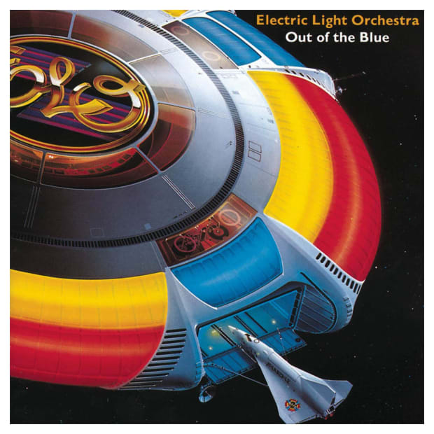
This beautiful gatefold-sleeve double album was where my love of album art began. It is the first record I remember my mother playing. I’m sure she did so every day for a year.
Released in 1977 and designed by Josh Kosh with art by the late Japanese illustrator Shusei Nagaoka, this is the landmark album from Electric Light Orchestra (ELO) – Jeff Lynne’s orchestral rock outfit. There was so much information printed on the inner sleeves; the beautifully executed and futuristic plane-docking-with-a-spaceship image was developed from the band’s logo which first appeared on their previous album. In addition, the record came with a pop-up cardboard model of the spaceship, all of which must have cost a fortune to produce.
The band created something of a story with their album imagery. The follow up album, Discovery, featured a desperate-looking Arabian man being chased through the desert, clutching a miniature ELO spaceship. Looking back now I can see how this release formed my opinion that if you’re going to include "something extra" with an album, it should be something the purchaser would cherish, be of high quality, and be well thought out.
Introspective - Pet Shop Boys (Parlophone)
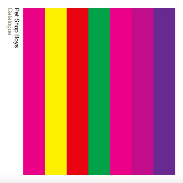
Introspective was released in 1988 – an important year for me in many respects. I turned 16, acid house reached us, and I realized what I wanted to do with my life: make electronic music. Designed by Peter Saville (as are most Pet Shop Boys album covers) the impact this had on me was huge and long lasting. It was shocking to me at the time. Neil and Chris were not on the cover of the album, instead were vertical neon stripes that really popped. This definitely influenced the design of my Pure Trance and Neon branding. Simplicity is the key. Keep it simple, balanced and clean and you can’t go wrong.
Solipsism - Joep Beving
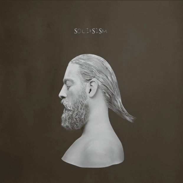
Amsterdam-based neoclassical composer and pianist Joep Beving released this wondrous debut album independently in 2015. The gatefold vinyl artwork features his head and shoulders styled like an ancient Greek bust.
It’s a striking image against a murky grey backdrop, and the album title is embossed in a delicious silver foil. I’m a diehard foil enthusiast - it’s a very expensive but an effective "spotting" effect, best used sparingly. I’ve insisted on it for a few of my albums. When it wasn’t used sparingly I think it almost doubled the production price of my 2008 Rain Stars Eternal album. The gatefold sleeve is the perfect medium for vinyl releases. Opening a new record "like a book" feels a bit like being "invited in," and for some reason seems to give an album a heightened sense of aesthetic value.
Chorus (CD Box Set) - Erasure (Mute)
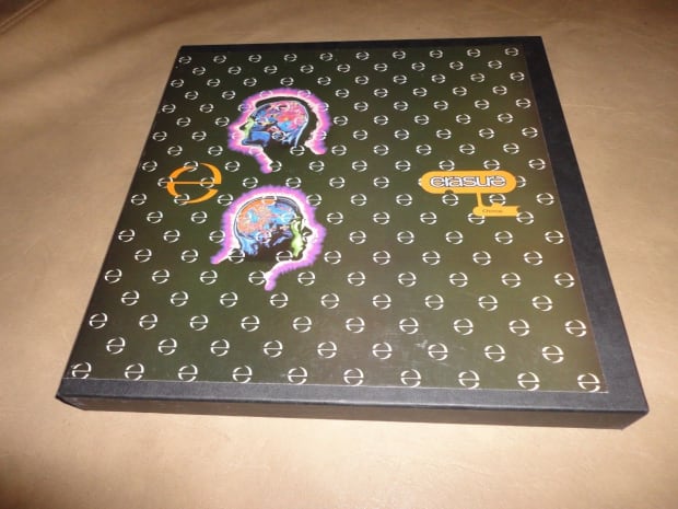
I bought this fabulous CD box set from U.K. pop act Erasure upon release in 1991. It was the final release from their "imperial" phase when they were the biggest pop group in the U.K. It was a complete departure from their previous releases - very "electronic" looking. Designed by the Me Company, the box set consisted of a solid, thick cardboard box printed in matt black with very futuristic cyborg-esque images of Andy and Vince. It came with several white-bordered thick cardboard art prints plus the CD itself.
It was the perfect box set to me - I based the content of my One album box-set on it quite closely. In fact when the One box set was first mooted I immediately thought of Chorus. The One box is constructed in the same way as Chorus, and the six CD-sized art cards included with One have the same white border. The paper used for them is even the same weight.
Group Therapy Radio - Above & Beyond
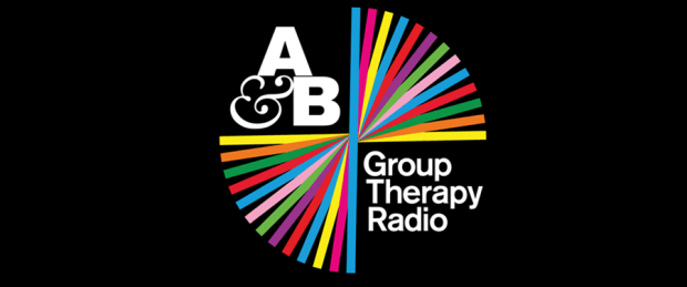
Not album art as such, but this has to factor in this selection. It’s also really satisfying to be able to include one of my contemporaries in this small collection of my favorites. Above & Beyond have always been on point with their branding and live visuals, but when they launched Group Therapy Radio I instantly fell in love with the "knotted, multi-colored ribbon" design.
I’m not sure who came up with the idea but it is so representative of how trance music connects people, it encapsulates everything about why the trance family exists and why the bond between trance fans worldwide is so strong. I was a little jealous of it, to be honest! Why didn’t I think of that?!! It was so simple but incredibly powerful. I love the way the guys continued the theme across subsequent events, like the "bicycle wheel spokes" imagery used for ABGT200, the "tent" of ABGT250, and the "dragon" of ABGT300.
Welcome to the Pleasuredome - Frankie Goes To Hollywood (ZTT)
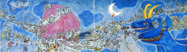
In the mid-'80s Frankie Goes To Hollywood exploded - musically and visually – into the world of pop music. Zang Tuum Tumb, the label set up by now legendary producer Trevor Horn (also a huge influence on me in terms of production) collectively understood the power and impact of album art probably more than anybody else at the time.
The S&M sleeve imagery of the first Frankie single (and its content) got the record banned, creating a media frenzy that sent it to No. 1. The typography, logos, branded T-Shirts (Frankie Says Relax, etc) were so exciting. It took the use of artistic statements in pop music to another level. The fact that the music was so inventive and innovative (thanks to Trevor Horn’s production) gave the huge media campaign serious weight.
When I got my copy of the debut album (again a polished and perfectly executed gatefold package) my mind was blown. I’d never seen something so bold and colorful. A Picasso pastiche of animals making their way into an enormous erect penis, no less – although it was actually a few years later that I realized what I was looking at. When Frankie split I think I actually missed the art way more than the music.
Follow Solarstone:
Facebook: facebook.com/solarstone
Twitter: twitter.com/richsolarstone
Instagram: instagram.com/richsolarstone
SoundCloud: soundcloud.com/solarstone
source https://edm.com/features/solarstone-album-art-op-ed
from Mad Mohawk Films https://ift.tt/2O4ghnP
via IFTTT
No comments:
Post a Comment